Choosing the right logo design is a crucial step when starting a business. Think of it as the face of your company – it is the first thing that consumers will see once they encounter your brand. It serves as the foundation of your brand identity and it is what separates you from your competitors. If done correctly, your logo can create positive associations between your company and your target audience. To help you, we have broken down 7 logo design ideas that you would want to consider for your business.
1. Monogram
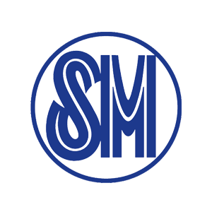
Monograms, also known as letter marks, are commonly used to represent the initials of a business. If your company’s name is too lengthy, hard to pronounce, or just not distinct enough to carry its own weight, then using a monogram logo is one that you should consider.
Moreover, monograms are sustainable and are relatively easy to replicate across marketing collateral. Because the focus is on the letters themselves, make sure that the font you choose is readable and eye-catching enough to capture the attention of the viewer. Customizing the characters in some way will make a monogram much more distinctive, helping it stand out from the crowd and appeal to a wider audience.
For newcomers out there, you might want to add your full business name below the monogram so that people can recognize you right away.
2. Wordmark
Wordmarks or logotypes feature the name of the business alone. It is suited to companies whose names are short, distinct, and unique. It can also be a great option for new businesses that need to boost their name recognition. Just like in a monogram, typography is also important for this kind of logo design. The style of words should elicit meaning and evoke the personality of the brand. If not done well, a wordmark alone can be generic and can lack mnemonic value.
3. Pictorial Mark
Also referred to as a brand mark or logo symbol, a pictorial mark logo consists of a graphic icon or symbol – one that usually signifies a real-life object. Brand marks can draw inspiration from many places so long as the chosen symbol is appropriate for your industry, resonates with your target audience, and is unique but not over-complicated. It is best suited for companies that:
- Have business names that can be depicted into a real-life object
- Have local names that do not lend well to its international translation
- Specialize in one product or service that can be easily represented by an image
It should be noted that pictorial marks are not accompanied by any text, which makes it difficult for companies to establish their identity as it is purely an image. If your business is new and has not yet established a stable target audience, it might be better to start with something more explicit for your business logo and adapt it as a brand mark later. Moreover, it is also not the best option if you anticipate changes to your business model in the future.
4. Abstract Logo Mark
On the other hand, if you do not want to be restricted to a picture that is something recognizable, abstract logo marks allow you to craft something that is tailored to your brand. You can play with lines, shapes, and colors to form a logo design that truly elicits your brand personality and values. However, abstract logo marks have the potential to create confusion if not designed well.
5. Mascot
Using mascots for your business logos can induce a wholesome atmosphere by appealing to families and children. These are illustrated characters or personas, not necessarily in the form of humans, that act as the spokesperson of the company. The style and inspiration for mascots can vary from fictitious characters to real people. Mascots can humanize your brand to make it more relatable. It is a good way to connect with your audience and to encourage customer interaction.
6. Combination Marks
A combination mark is the fusion of word-based (monogram or wordmark) and icon-based (pictorial mark, abstract logo mark, or mascot) logo designs. Combination marks give the audience multiple visual cues leading to effortless brand recognition. Moreover, versatility and flexibility are its greatest assets. You can add or remove individual elements as needed without compromising the integrity of the logo, making it adaptable across platforms.
7. Emblem
One of the oldest forms of a business logos is the emblem. Elements of this logo design include a text and/or a symbol inside a container – think of seals, crests, badges, and stamps. Emblems are used to increase a consumer’s feelings of brand quality, reliability, and longevity. It can impart a sense of professionalism and tradition. Thus, it is often the go-to choice for many schools, universities, organizations, and government agencies. Some companies have also effectively modernized the classic emblem appearance to make it fit for the 21st century.
One of the setbacks of having an emblem business logo is its scalability. Because of their intricate details, emblems can be trickier to shrink down for use on marketing materials
Takeaway
There is no “one size fits all” when it comes to choosing the right logo design for your business. Whatever logo design ideas you apply, your design should mark an impression of your brand. It must be memorable and it must stand out from the rest of your competitors. Ultimately, it should not deviate from your company’s purpose, personality, and values.
At Verafede, we value and understand the brand identity of each and every client. We are here to help and guide you to bring your vision into reality especially in terms of creating a logo that is fit for your brand. For collaborations and business inquiries, feel free to contact us here!
Related Reads:
Influencer Marketing vs. Celebrity Marketing: Which is a Better Fit for your Brand?
8 Ways to Improve Your Brand Perception

Mary Antonette Escalona
Toni Escalona is a college senior taking up B.A. in Communication and Media Studies at the University of the Philippines Visayas. A self-proclaimed wanderlust, she likes travelling and eating local food with her friends.
